Question: What is the most common design mistake small businesses make?
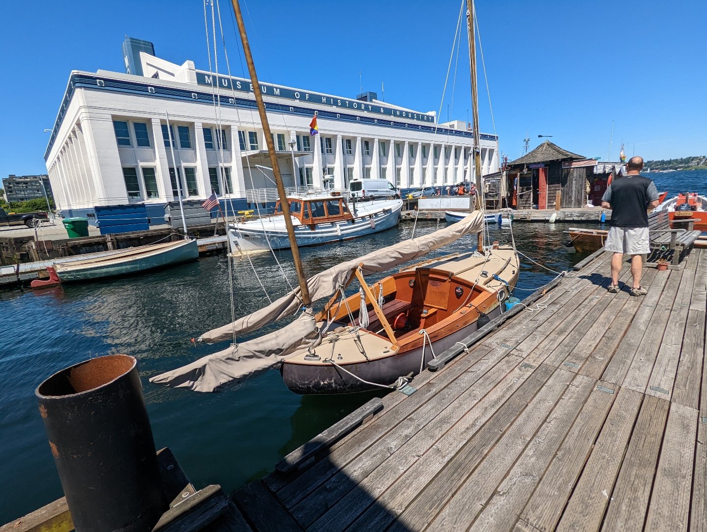
MOHAI Seattle
Seattle, WA
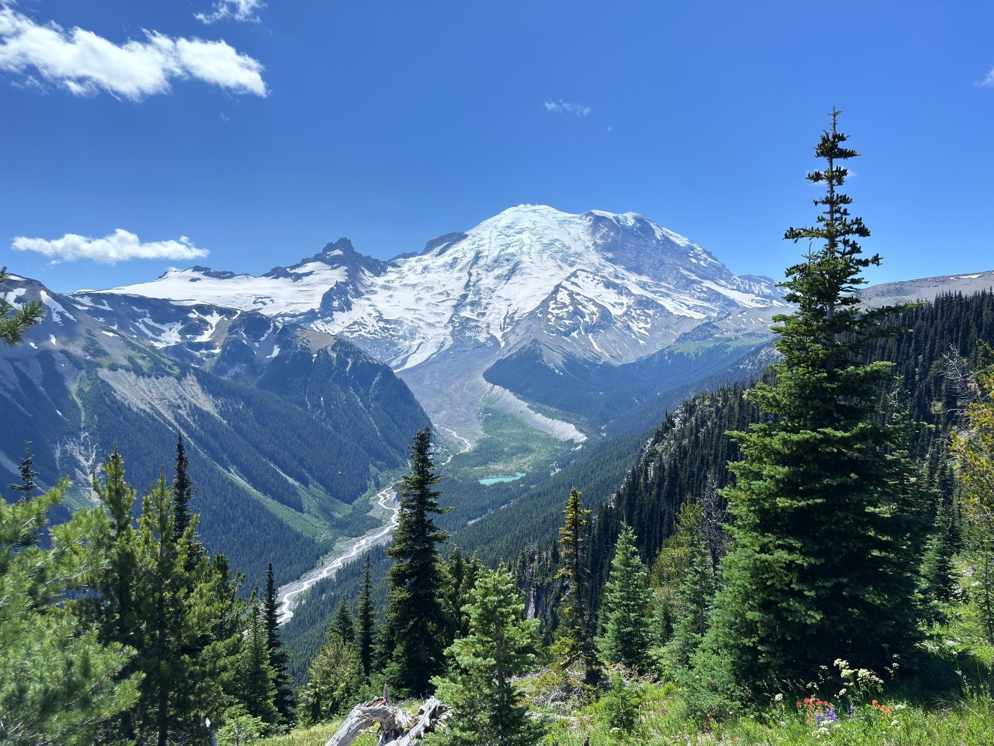
Mount Rainier National Park
Mount Rainier, WA
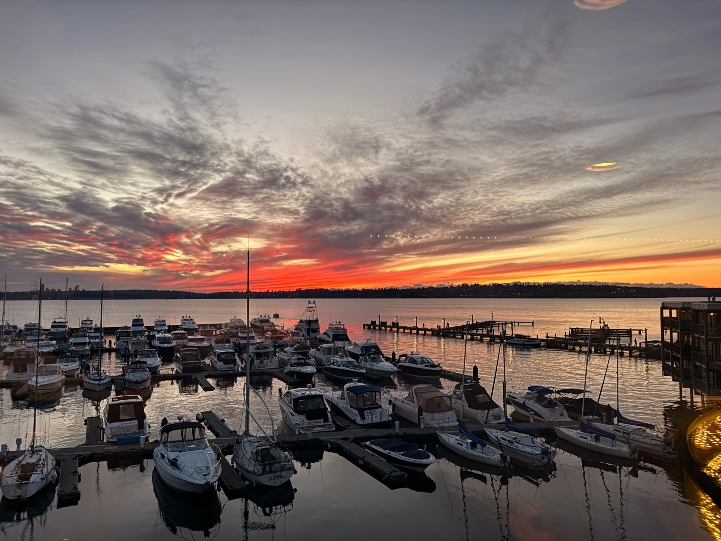
Kirkland Homeport Marina
Kirkland, WA
Sunrise
Puyallup, WA
Lynnwood Convention Center
Lynnwood, WA
Everett Marina
Everett, WA
Costco Alderwood
Lynnwood, WA
Kerry Park
Seattle, WA
Lumen Field
Seattle, WA
Theatre District
Tacoma, WA
Lincoln Park
West Seattle, WA
Lynnwood Recreation Center
Lynnwood, WA
Everett Waterfront
Everett, WA
Mill Creek Town Center
Mill Creek, WA
Mount Rainier National Park
Mount Rainier, WA
Sunrise Park
South Hill, WA
Edmonds Bowl
Edmonds, WA
Downtown Everett
Everett, WA
Point Ruston
Tacoma, WA
South Lake Union
Seattle, WA
Renton Southport
Renton, WA
Lighthouse Park
Mukilteo, WA
Bellevue Downtown Park
Bellevue, WA
West Valley Highway
Kent, WA
Meydenbauer Bay Park
Bellevue, WA
Lake Tapps
Lake Tapps, WA
Lake Sammamish State Park
Issaquah, WA
Snohomish River
Snohomish, WA
Alderwood Mall
Lynnwood, WA
Sunrise
Puyallup, WA
Alderwood
Lynnwood, WA
Boeing Renton Factory
Renton, WA
Pioneer Park
Puyallup, WA
Brooklyn Bros Pizza
Mill Creek, WA
Meydenbauer Bay Park
Bellevue, WA
Bellevue Square
Bellevue, WA
Train Track in Edmonds
Edmonds, WA
WA State Fair
Puyallup, WA
Green Lake
Seattle, WA
Mill Creek Town Center
Mill Creek, WA
Weyerhauser Aquatic Center
Federal Way, WA
Kent Valley
Kent, WA
Gene Coulon Memorial Beach Park
Renton, WA
Redmond Town Center
Redmond, WA
IKEA Renton
Renton, WA
Ballard Locks
Seattle, WA
Author: Jake Ni
|
Published: Apr 02, 2026
|
Updated: Apr 16, 2026
Answer:
The speaker does not reduce this to one single issue but instead describes it as a combination of common mistakes. The biggest one is not having strong call-to-actions. A website is not just supposed to sit there and look pretty. Its function is to help convert visitors into paying customers. If there are no clear actions such as “Call Now,” “Text Now,” “Contact Us,” or “Get a Quote,” the site is already missing one of its most important jobs.
The second major mistake is the misuse of colors. Businesses sometimes choose colors that do not fit their industry or brand identity. A law firm, for example, should not look overly casual or playful if it wants to be perceived as serious and trustworthy.
The third major mistake is choosing the wrong font. Typography has to match the business. Formal businesses need formal or clean font choices. A highly decorative or unserious font can immediately hurt credibility.
So the speaker’s broader point is that small business websites often make mistakes not just in one area, but across multiple brand and usability elements. Calls to action, colors, and fonts all need to support the same professional message.
Summary:
The answer identifies three especially common design mistakes on small business websites: missing call-to-action elements, poor color choices, and poor font choices. The speaker emphasizes that a website is a functional business tool, not just an aesthetic object, so failing to include action-oriented prompts is a major problem. He also explains that colors and typography send immediate signals about professionalism, industry fit, and brand tone. When those signals are wrong, the entire website can feel less trustworthy. The key message is that website design mistakes often happen in combination, and businesses need to think holistically about function, branding, and usability rather than evaluating each visual choice in isolation.
About the Author
Jake Ni
Account Executive at 1 Stop Link
Jake believes that small businesses are the backbone of America.
They deserve to benefit from the latest technology that fail to trickle down from "big tech".
With expert local knowledge and over 7 years of industry experience, he's ready to help you build a top tier web presence!
Book a video consultation with Jake:
More Articles Like This
We Have The Proof: Top Rated Digital Marketing Agency in WA
1 Stop Link is 5 star rated on Google. Read words of appreciation from our clients.
No Stock Images, Just Real People and Real Testimonials
Watch our clients share their success stories in their own words.