Question: Should my website use dark mode or light mode or should it have an option?
IKEA Renton
Renton, WA
Lynnwood Convention Center
Lynnwood, WA
Kerry Park
Seattle, WA
Redmond Town Center
Redmond, WA
Mill Creek Town Center
Mill Creek, WA
Ballard Locks
Seattle, WA
South Lake Union
Seattle, WA
Brooklyn Bros Pizza
Mill Creek, WA
West Valley Highway
Kent, WA
Bellevue Square
Bellevue, WA
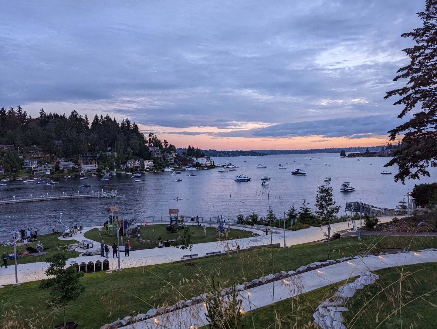
Kirkland Homeport Marina
Kirkland, WA
Mill Creek Town Center
Mill Creek, WA
Costco Alderwood
Lynnwood, WA
Lighthouse Park
Mukilteo, WA
Renton Southport
Renton, WA
Point Ruston
Tacoma, WA
Mount Rainier National Park
Mount Rainier, WA
Snohomish River
Snohomish, WA
Sunrise
Puyallup, WA
Boeing Renton Factory
Renton, WA
Lake Sammamish State Park
Issaquah, WA
Gene Coulon Memorial Beach Park
Renton, WA
Edmonds Bowl
Edmonds, WA
MOHAI Seattle
Seattle, WA
Pioneer Park
Puyallup, WA
Everett Waterfront
Everett, WA
Mount Rainier National Park
Mount Rainier, WA
Train Track in Edmonds
Edmonds, WA
Downtown Everett
Everett, WA
Alderwood Mall
Lynnwood, WA
Alderwood
Lynnwood, WA
Meydenbauer Bay Park
Bellevue, WA
Lincoln Park
West Seattle, WA
Everett Marina
Everett, WA
Bellevue Downtown Park
Bellevue, WA
WA State Fair
Puyallup, WA
Weyerhauser Aquatic Center
Federal Way, WA
Lake Tapps
Lake Tapps, WA
Sunrise Park
South Hill, WA
Sunrise
Puyallup, WA
Kent Valley
Kent, WA
Meydenbauer Bay Park
Bellevue, WA
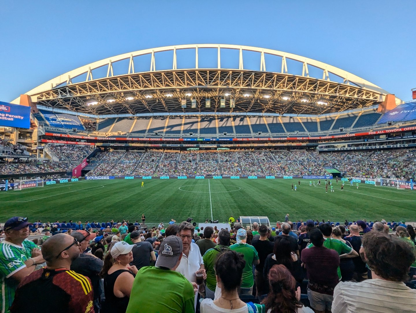
Lumen Field
Seattle, WA
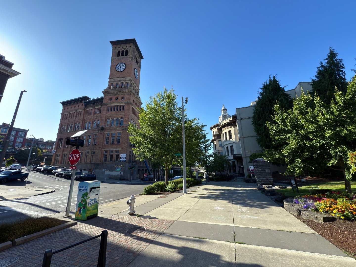
Theatre District
Tacoma, WA
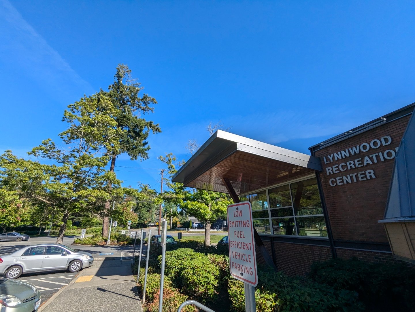
Lynnwood Recreation Center
Lynnwood, WA
Green Lake
Seattle, WA
Author: Jake Ni
|
Published: Mar 20, 2026
|
Updated: Apr 16, 2026
Answer:
This is more about user preference than a hard rule. In general, studies and common behavior suggest that most people prefer lighter backgrounds, especially because dark backgrounds with light text can strain the eyes more during long reading sessions. So for many websites, light mode remains the more natural default.
That said, dark mode has become more common in apps and digital products, and some people do prefer it, especially in low-light situations or at night. Because of that, dark mode can still be a useful option.
The best recommendation is to give users the choice if the business wants to include both. Rather than locking everyone into one mode, it can be beneficial to offer a toggle between light mode and dark mode. That makes the website more flexible and gives visitors control over what is more comfortable for them.
So the answer is not that one mode is always right and the other is always wrong. The better approach is to understand that people have different preferences and, when possible, design with that flexibility in mind.
Summary:
The answer treats dark mode versus light mode as a preference-based design decision rather than a strict requirement. While lighter backgrounds are generally easier on the eyes and more commonly preferred, dark mode still has value for some users, especially in nighttime or low-light use cases. The speaker recommends flexibility wherever possible, suggesting that a website should ideally allow users to choose between the two rather than forcing one universal setting. The overall point is that mode selection should be guided by user comfort and brand fit rather than trend-following alone. If implemented thoughtfully, an optional toggle can enhance the user experience without compromising the site’s professionalism.
About the Author
Jake Ni
Account Executive at 1 Stop Link
Jake believes that small businesses are the backbone of America.
They deserve to benefit from the latest technology that fail to trickle down from "big tech".
With expert local knowledge and over 7 years of industry experience, he's ready to help you build a top tier web presence!
Book a video consultation with Jake:
More Articles Like This
We Have The Proof: Top Rated Digital Marketing Agency in WA
1 Stop Link is 5 star rated on Google. Read words of appreciation from our clients.
No Stock Images, Just Real People and Real Testimonials
Watch our clients share their success stories in their own words.