Question: How do I make my website easier for customers to navigate?
Brooklyn Bros Pizza
Mill Creek, WA
Pioneer Park
Puyallup, WA
Green Lake
Seattle, WA
Theatre District
Tacoma, WA
Everett Marina
Everett, WA
Mount Rainier National Park
Mount Rainier, WA
Ballard Locks
Seattle, WA
Lynnwood Convention Center
Lynnwood, WA
Bellevue Square
Bellevue, WA
Edmonds Bowl
Edmonds, WA
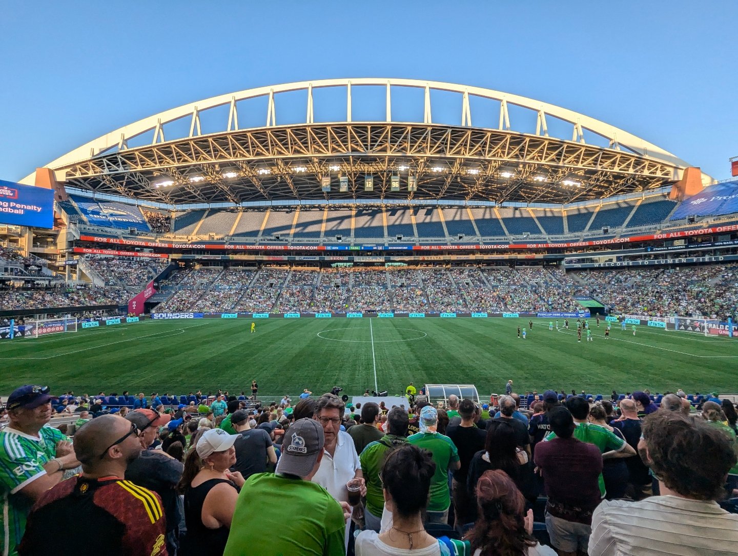
Lumen Field
Seattle, WA
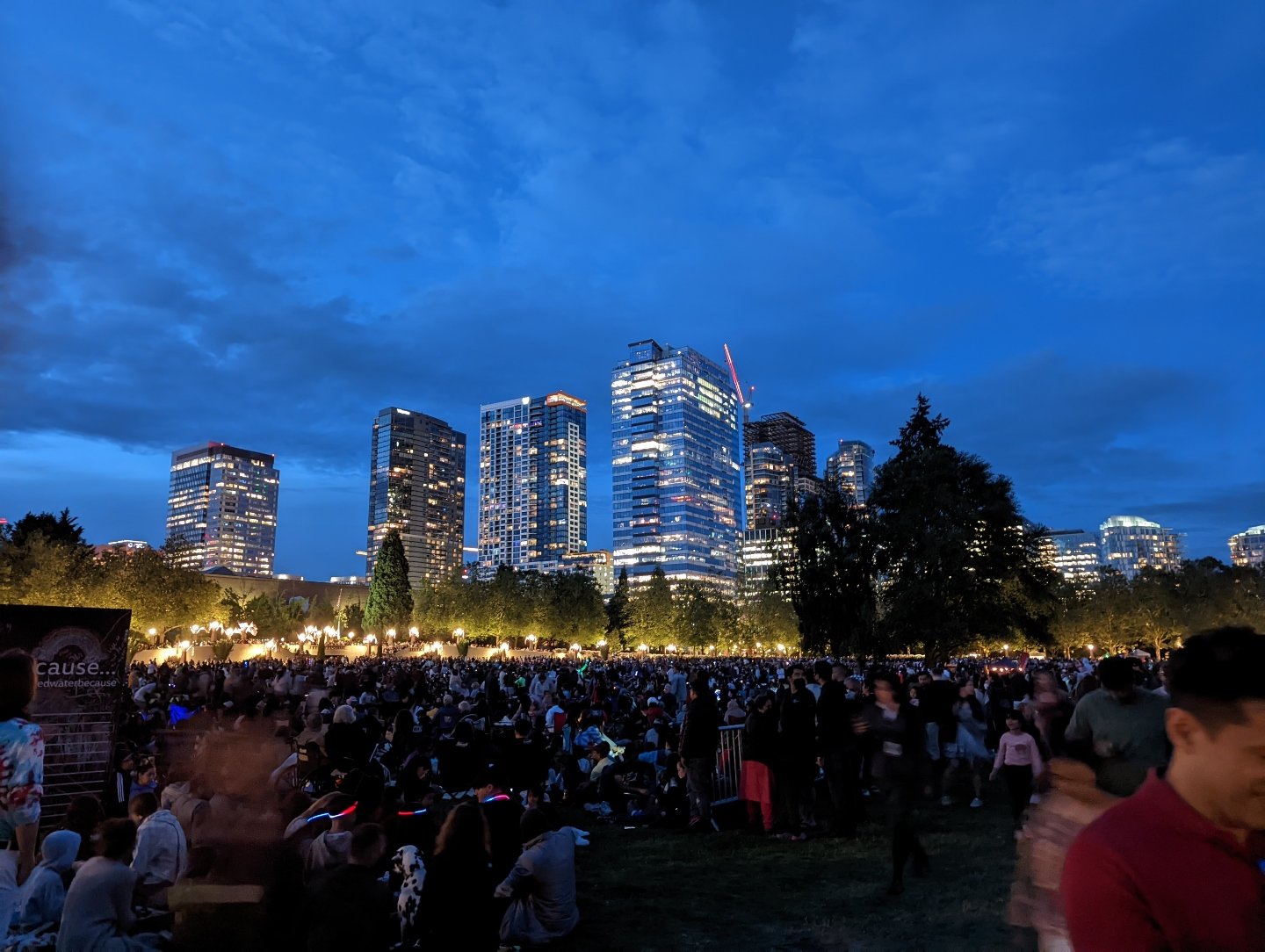
Bellevue Downtown Park
Bellevue, WA
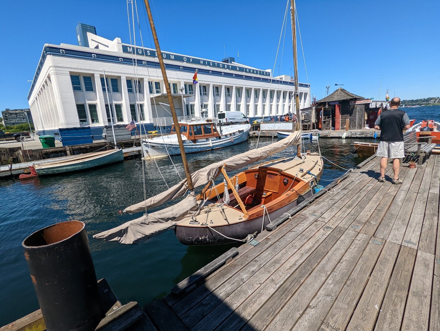
MOHAI Seattle
Seattle, WA
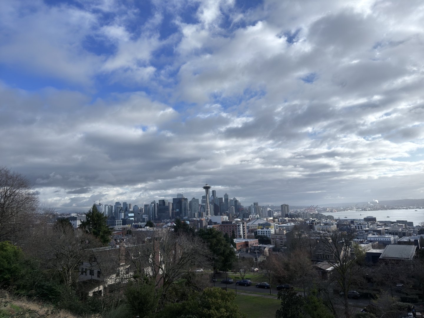
Kerry Park
Seattle, WA
Lake Sammamish State Park
Issaquah, WA
Snohomish River
Snohomish, WA
Lynnwood Recreation Center
Lynnwood, WA
Costco Alderwood
Lynnwood, WA
WA State Fair
Puyallup, WA
Mill Creek Town Center
Mill Creek, WA
Kirkland Homeport Marina
Kirkland, WA
Redmond Town Center
Redmond, WA
Alderwood
Lynnwood, WA
Kent Valley
Kent, WA
West Valley Highway
Kent, WA
Sunrise
Puyallup, WA
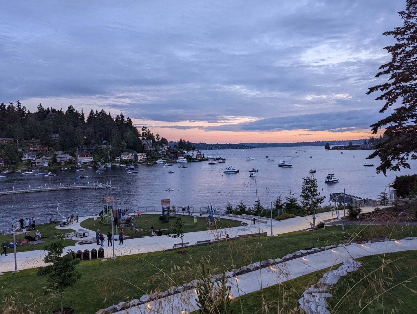
Meydenbauer Bay Park
Bellevue, WA
Weyerhauser Aquatic Center
Federal Way, WA
Renton Southport
Renton, WA
Mill Creek Town Center
Mill Creek, WA
Train Track in Edmonds
Edmonds, WA
Point Ruston
Tacoma, WA
Sunrise
Puyallup, WA
South Lake Union
Seattle, WA
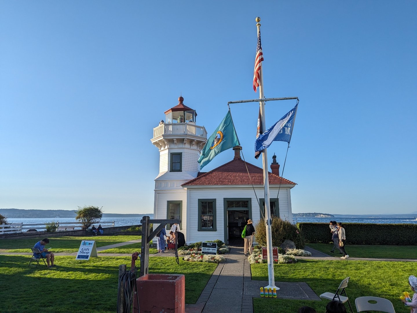
Lighthouse Park
Mukilteo, WA
Meydenbauer Bay Park
Bellevue, WA
Everett Waterfront
Everett, WA
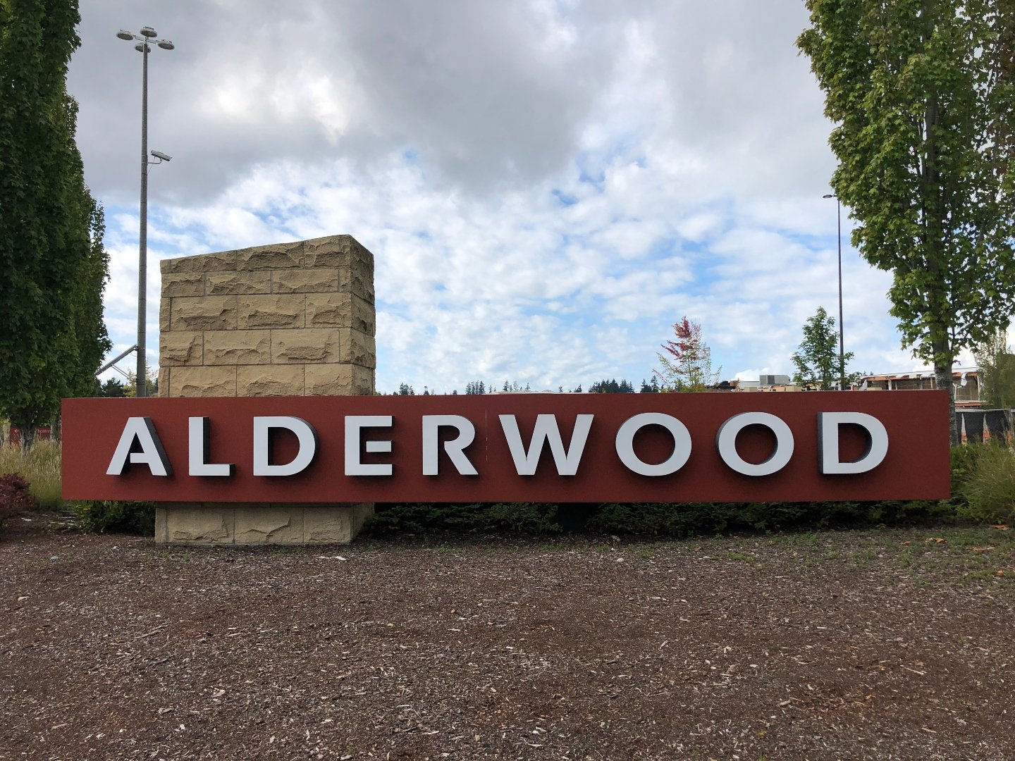
Alderwood Mall
Lynnwood, WA
Gene Coulon Memorial Beach Park
Renton, WA
Lincoln Park
West Seattle, WA
Downtown Everett
Everett, WA
IKEA Renton
Renton, WA
Mount Rainier National Park
Mount Rainier, WA
Sunrise Park
South Hill, WA
Boeing Renton Factory
Renton, WA
Lake Tapps
Lake Tapps, WA
Author: Jake Ni
|
Published: Jan 09, 2026
|
Updated: Apr 16, 2026
Answer:
The first step is making sure the website is mobile-friendly. On a phone, visitors should be able to scroll straight up and down with their thumb. There should not be awkward side-to-side movement or constant zooming in and out just to read or interact with the content. A streamlined mobile experience is one of the most important parts of navigation today.
The second major factor is having clear call-to-actions in prominent places. If the user needs to call, text, message, or request a quote, those options should be obvious and easy to reach. Those are part of navigation too, because they help the visitor move toward the action the business wants them to take.
Navigation menus should also be handled properly. On desktop, the navigation should usually be at the top, and ideally it should remain visible as the user scrolls. That is often called a sticky navigation. On mobile, the menu should be housed in a standard hamburger icon so users can easily access the site structure without cluttering the screen.
Overall, easy navigation comes from simplicity, consistency, and making the next step obvious for the user.
Summary:
The answer frames navigation as a combination of mobile usability, clear calls to action, and strong menu structure. A website should allow visitors to move smoothly through the content without awkward gestures, confusion, or hidden pathways. The speaker highlights vertical scrolling, visible actions like “Call Now,” and standard menu systems such as sticky navigation bars on desktop and hamburger menus on mobile. These elements reduce friction and help users quickly find what they need. The main takeaway is that navigation is not only about menus—it is about designing the whole user experience so that visitors can easily understand the website and take action without frustration.
About the Author
Jake Ni
Account Executive at 1 Stop Link
Jake believes that small businesses are the backbone of America.
They deserve to benefit from the latest technology that fail to trickle down from "big tech".
With expert local knowledge and over 7 years of industry experience, he's ready to help you build a top tier web presence!
Book a video consultation with Jake:
More Articles Like This
We Have The Proof: Top Rated Digital Marketing Agency in WA
1 Stop Link is 5 star rated on Google. Read words of appreciation from our clients.
No Stock Images, Just Real People and Real Testimonials
Watch our clients share their success stories in their own words.